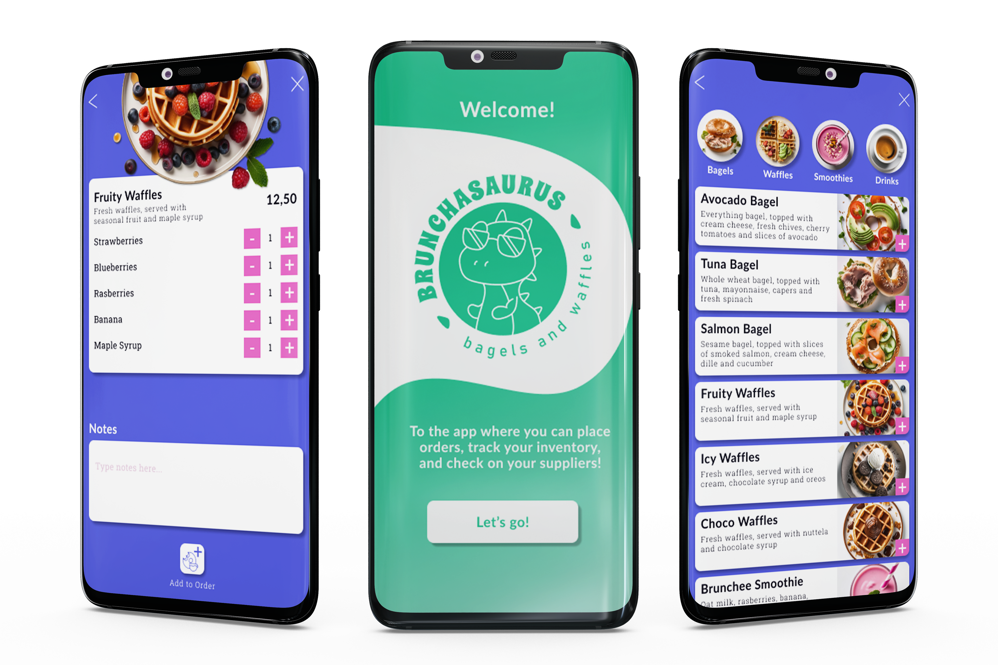
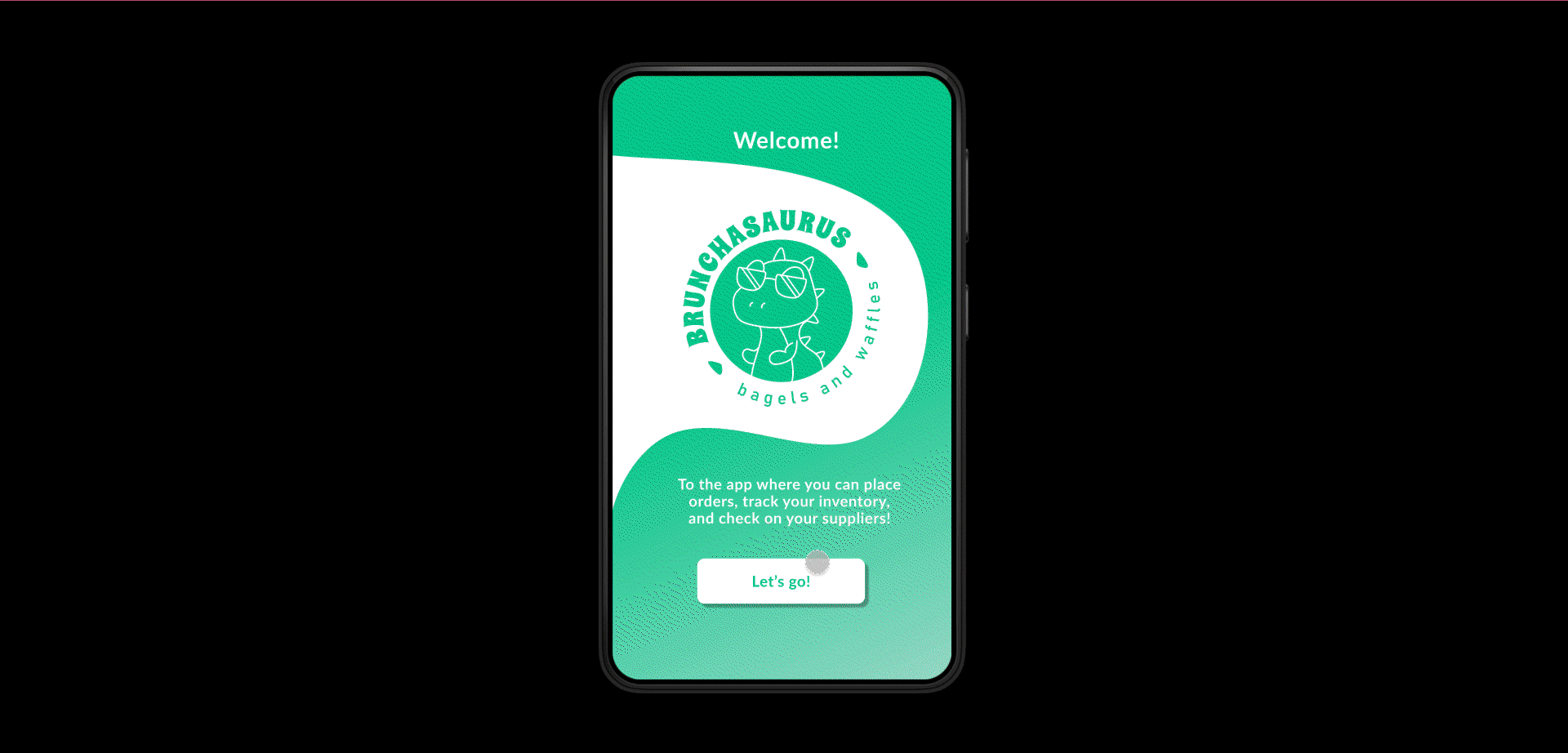
BRUNCHASAURUS
Project Type: Case Study | Google UX Design Certificate
Service(s): UX Research, UX/UI Design
Year: 2024
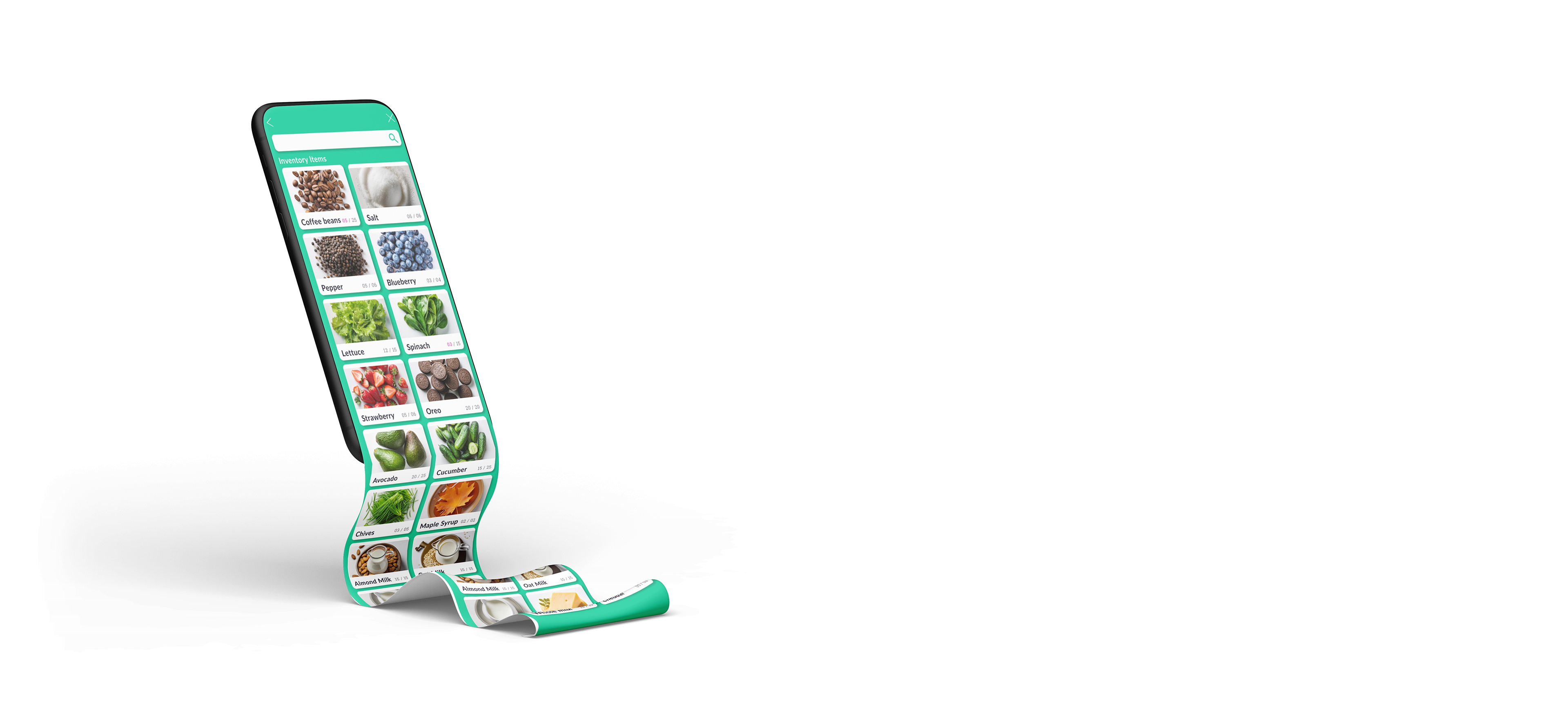
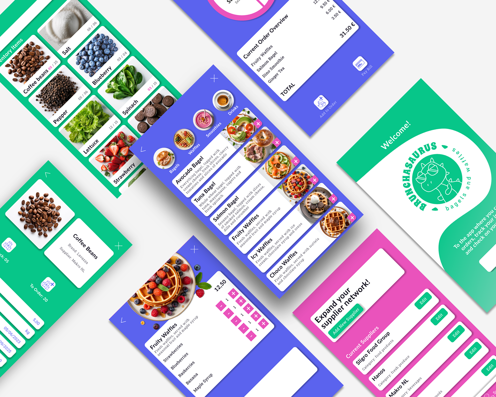
Brunchasaurus is an app where users that work in a brunch café can digitize their daily tasks in three ways:
• Placing orders
• Checking/updating the inventory
• Contacting/editing suppliers
UX RESEARCH
Overview
Background: The Brunchasaurus App, designed for a new brunch café in Amsterdam, allows the front-of-house employees place orders, updating the inventory in real time and communicating with the back-of-house.
Research Goals: I wanted to investigate what are the main struggles people that work in the F&B industry face when using technology, so that I can create an efficient and easy to use platform.
Methodologies:
• User Interviews
• Competitive Analysis
Research Goals: I wanted to investigate what are the main struggles people that work in the F&B industry face when using technology, so that I can create an efficient and easy to use platform.
Methodologies:
• User Interviews
• Competitive Analysis
User Interviews
In order to understand the user frustrations, needs and requirements, I conducted 3 interviews with employees in the F&B industry. Their common pain points were:
• The front and back-of-house staff fail to communicate efficiently regarding the unavailable dishes and the ingredients used in recipes.
• The level of food waste is high due to a lot of ingredients expiring.
• The communication with the suppliers requires a lot of time and effort.
These issues cause loss of profit, bad customer reviews, increased operating costs and a considerable environmental impact.
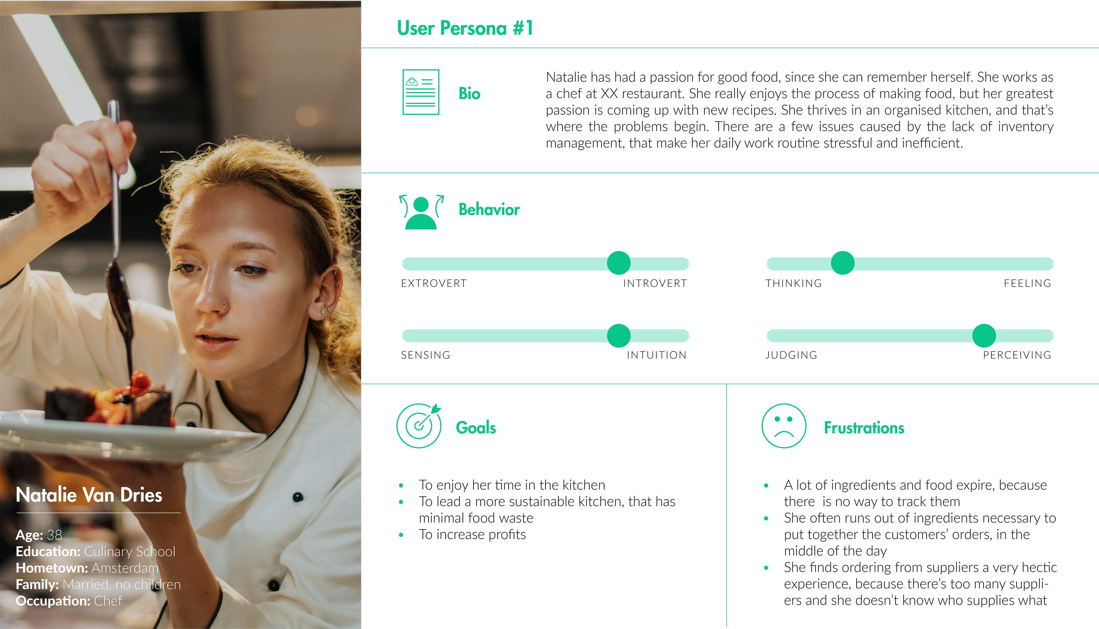
Click here to view all User Personas
Competitor Analysis
I ran a competitor analysis in order to see what works and what doesn't in current apps and if the design of a new app was necessary. The main research finds were:
• Need for an app that links in real time the inventory to the POS system
• Need for an app that links the inventory to the suppliers database
• Need for a reports feature, that draws data from the inventory
• Need for a simple, fast and intuitive ordering flow
• Need for product photos in the inventory and POS pages
• Need for an app that links the inventory to the suppliers database
• Need for a reports feature, that draws data from the inventory
• Need for a simple, fast and intuitive ordering flow
• Need for product photos in the inventory and POS pages
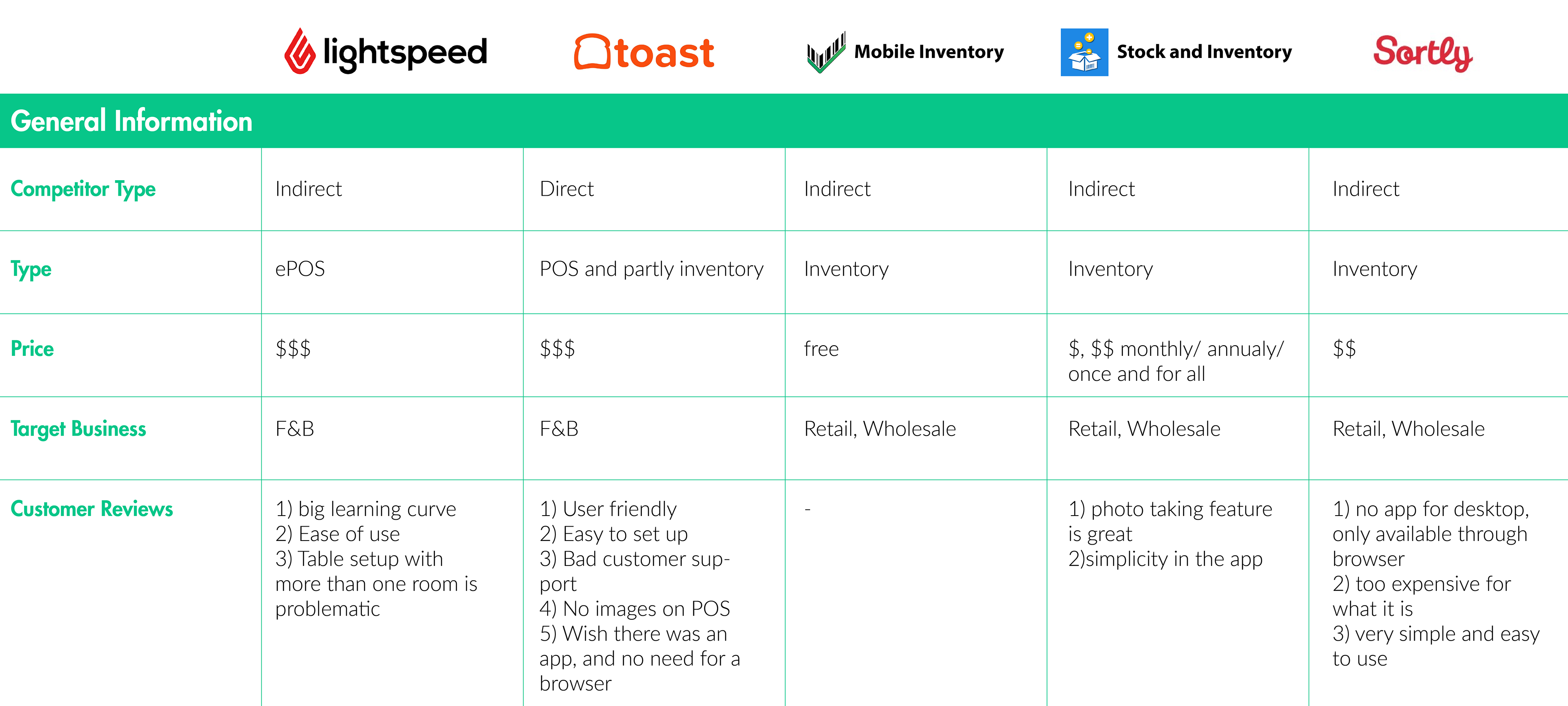
Click here to view the full Competitor Analysis
UX DESIGN
User Flows
I built user-focused flows to ensure that my personas can successfully complete their key objectives while reducing the existing pain points. The three key objectives are:
• Place an order
• Check Inventory
• Check Suppliers
• Place an order
• Check Inventory
• Check Suppliers
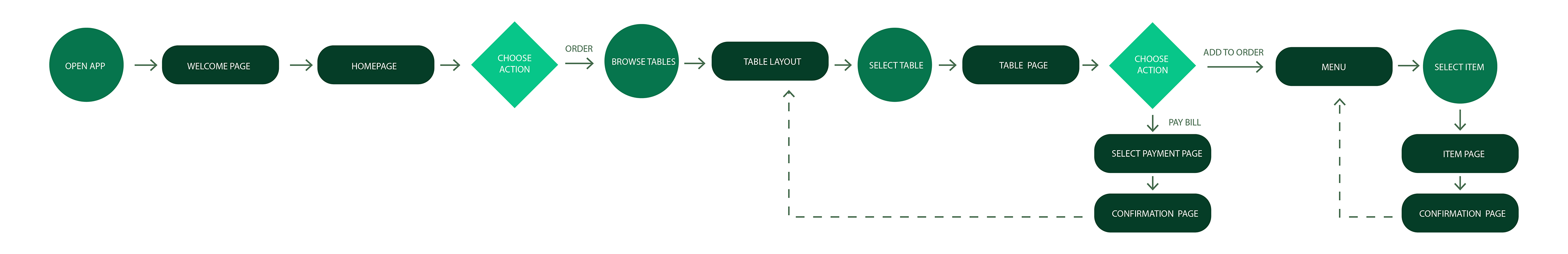
Click here to view all User Flows
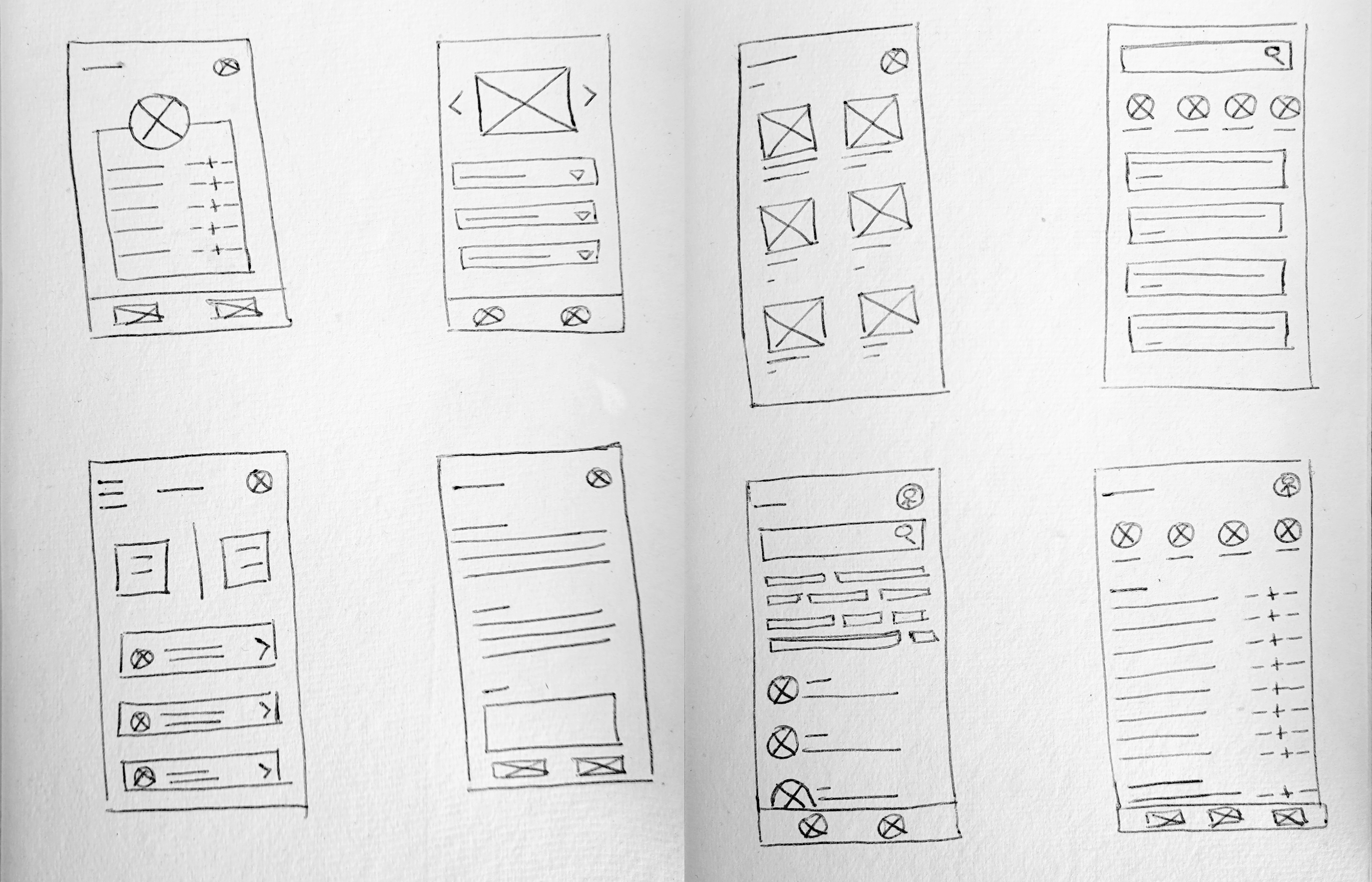
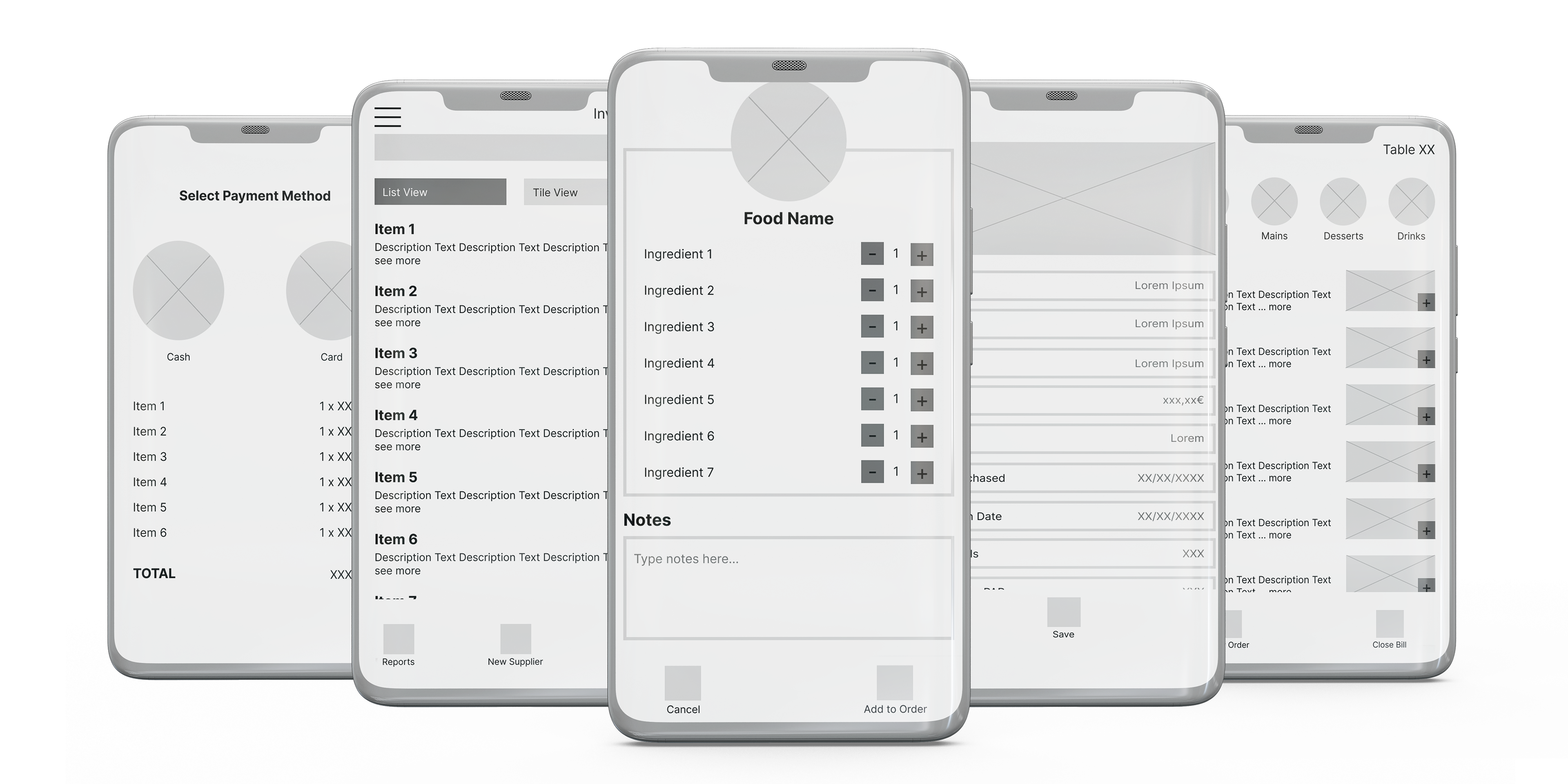
Wireframes & Lo-fi Prototype
Focusing on the core features identified during the UX research, I sketched the first wireframes using pen and paper, transferred them to Figma, and created a low-fidelity prototype to test functionality.
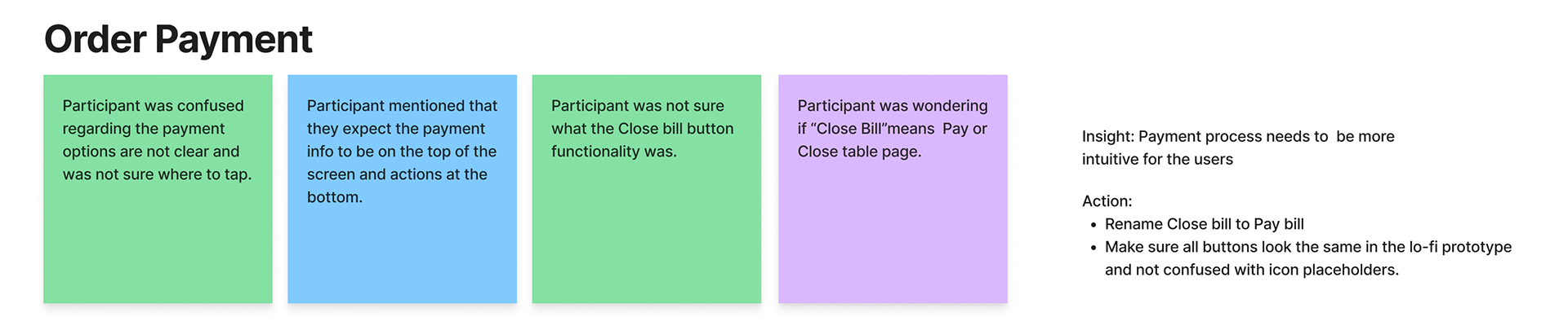
Usability Study
KPIs
• Time on task: How long it takes a user to complete a task
• User error rates: indicate the parts of a design that cause users to make errors
• Conversion rates: measures the percentage of users who complete the desired action
• System Usability Scale (SUS)
• User error rates: indicate the parts of a design that cause users to make errors
• Conversion rates: measures the percentage of users who complete the desired action
• System Usability Scale (SUS)
Click here to view the full Affinity Diagram
Challenges
While this project was presented as a linear process, UX design is anything but that. There were many back and forths, lots of sketching and re-wireframing, and a few usability tests to make sure users could find what they were looking for with ease and efficiency. The main topics that needed to be addressed were:
1) Navigation between the three main functions of the app (what started of as a hamburger menu ended up being a navigation tab for easy transition between tasks)
1) Navigation between the three main functions of the app (what started of as a hamburger menu ended up being a navigation tab for easy transition between tasks)
2) The ordering user flow (updating an existing order and keeping an overview)
UI DESIGN
Color and Type
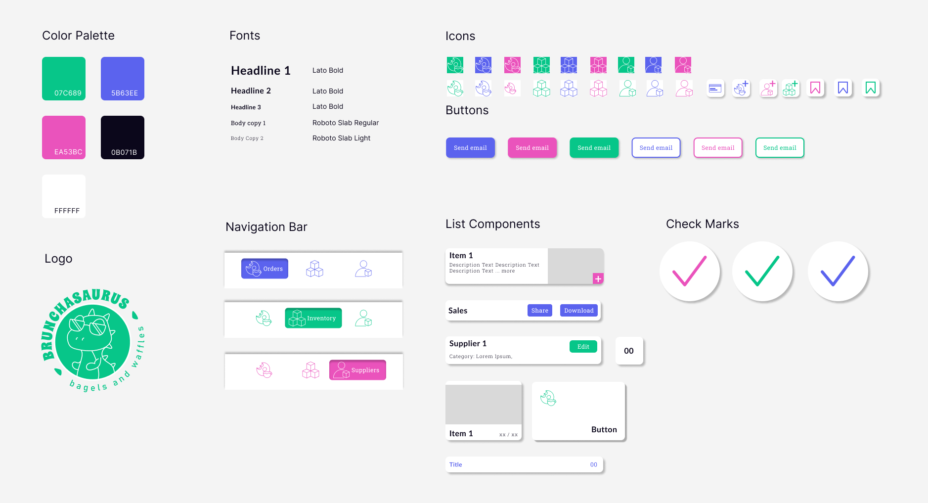
The branding has three primary colors. Each color is used to create a distinct visual theme for each section (purple is the primary color of the Order section, green of the Inventory section, and pink of the Suppliers section). A dark blue and a white are added to the color palette to achieve high contrast. The type scale uses two typefaces: Lato and Roboto Slab. The two typefaces make a quirky pair, adding to the character of the app.
Reflections
Looking back at this project I see it as a great introduction to the world of UX Design. While definitely not perfect, I think that the user flows are efficient and the users pain points have been addressed. Going back, I would have put accessibility at the forefront of my design decisions. The colors selection might potentially be overwhelming, both because of the high levels of saturation the lack of contrast. Same goes for the choice of typography. Nevertheless, it was a great experience and opportunity to work on the development of my UX skills.