WHO KILLED OBIDIAH?
Project Type: Case Study | Google UX Design Certificate
Service(s): UX Research, UX/UI Design
Year: 2024
Who Killed Obidiah? (WKO) is an Amsterdam-based murder mystery event company looking to reinvent their online presence by launching a responsive website in order to:
⦁ Retain existing customers
⦁ Acquire new customers
UX RESEARCH
Business Overview
WKO have been using event ticketing platforms to advertise and sell tickets to their events so far. This results in a lack of a reference point for existing customers to go back to when they want to book another one of their events, or refer them to their network.
Competitive Analysis
My research started at the business side of the project. A SWOT analysis of the business and its major competitors gave me an insight in the company and its position in the Amsterdam market. It helped me see some potential gaps in the market that could make WKO stand out.
The most important insight was the opportunity to build a community of murder mystery enthusiasts, thus creating loyal customers who, in turn would help the business grow organically. That meant that the business goals had to be re-evaluated, and adapted to focus on the existing customers.
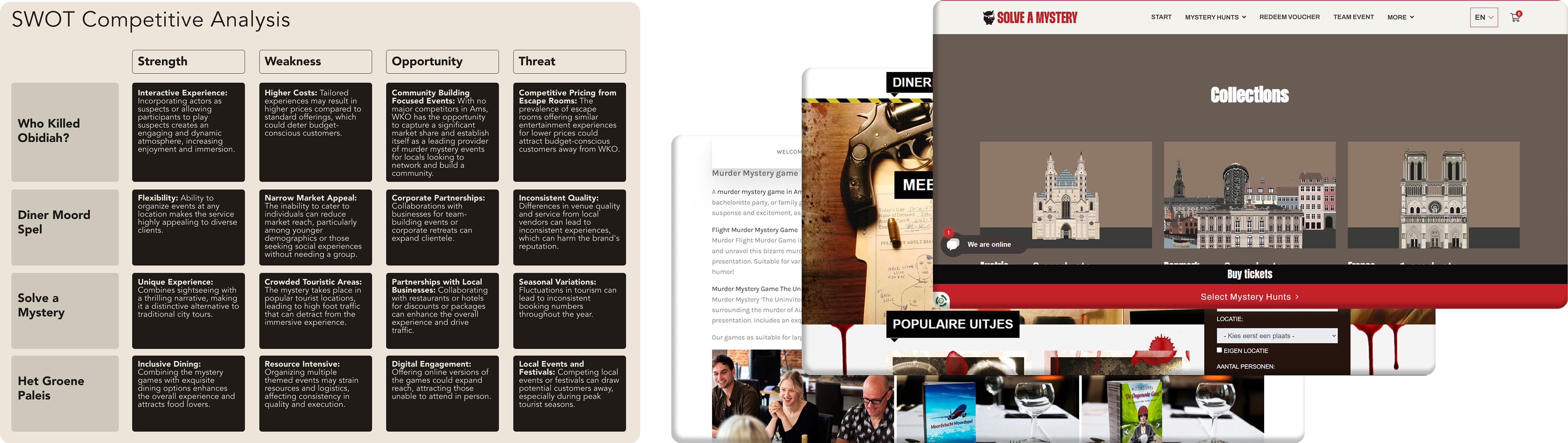
Click here to view SWOT Analysis
How might we reinvent WKO's online presence and create a sense of community so that they attract new participants and see past participants return for more events?
Goal 1: Higher retention rate
Goal 2: Higher referral rate
User Interviews
Next, I looked into the paint points of users trying to book an event online, and what drives them to refer / come back to an event organizing business. I interviewed 6 murder mystery event attendees, in order to establish their motives for attending the events and their pain points along the journey of booking, referring and communicating with the organizers.

Click here to view all User Personas and User Journeys
Secondary Research
Lastly, I conducted secondary research to discover established behavioral patterns regarding community building and customer referral, that would validate the insights from the user interviews. The patterns were:
Social Proof: Positive reviews and testimonials can encourage users to refer others.
Social Proof: Positive reviews and testimonials can encourage users to refer others.
Community Engagement: Building a sense of community around an event can motivate users to share their experiences with others.
Incentives: Referral programs that offer discounts, perks, or other incentives can motivate users to recommend the business to friends and family.
Hypotheses
1. We believe that we can achieve higher referral rates if Noah has access to all information of past and future events, and can easily book new tickets, in a new website with a profile page feature for personalized content and event information.
2. We believe that we can achieve higher retention rates if Jen can stay in contact with participants from the events, through a website feature focused on community building.
UX DESIGN
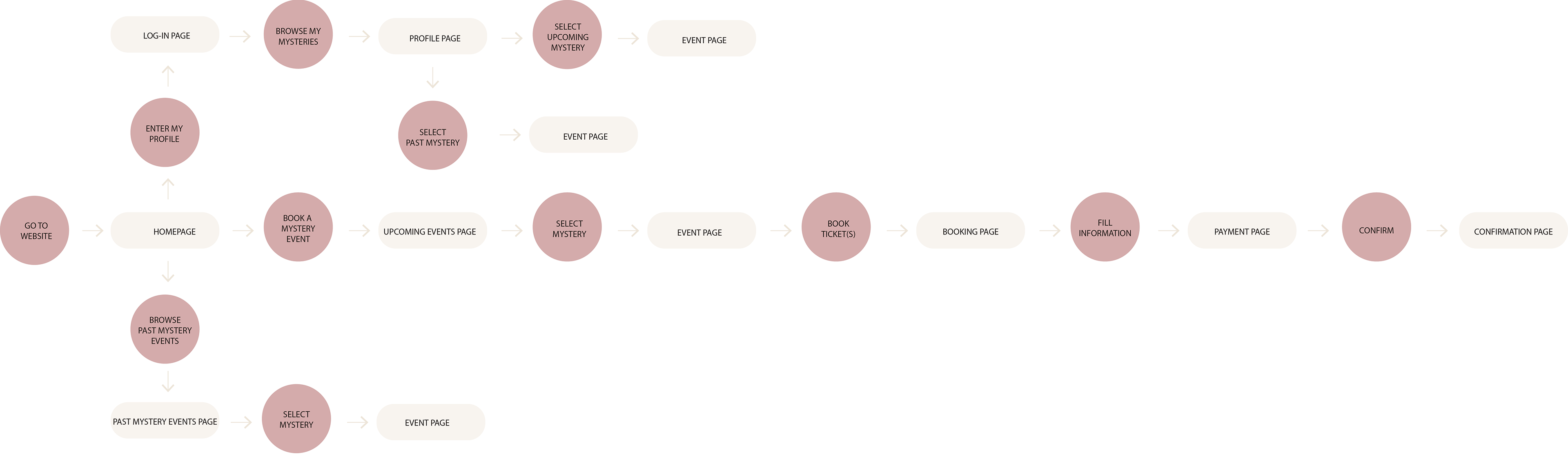
Information Architecture
Before diving into sketches and wireframes, I defined the user flows for the following tasks:
⦁ Browse past and future events
⦁ Book a ticket
⦁ Set up a profile
⦁ Access booked events
⦁ Book a ticket
⦁ Set up a profile
⦁ Access booked events
When the user flows were defined, I had an overview of all the necessary pages so I developed the site map.
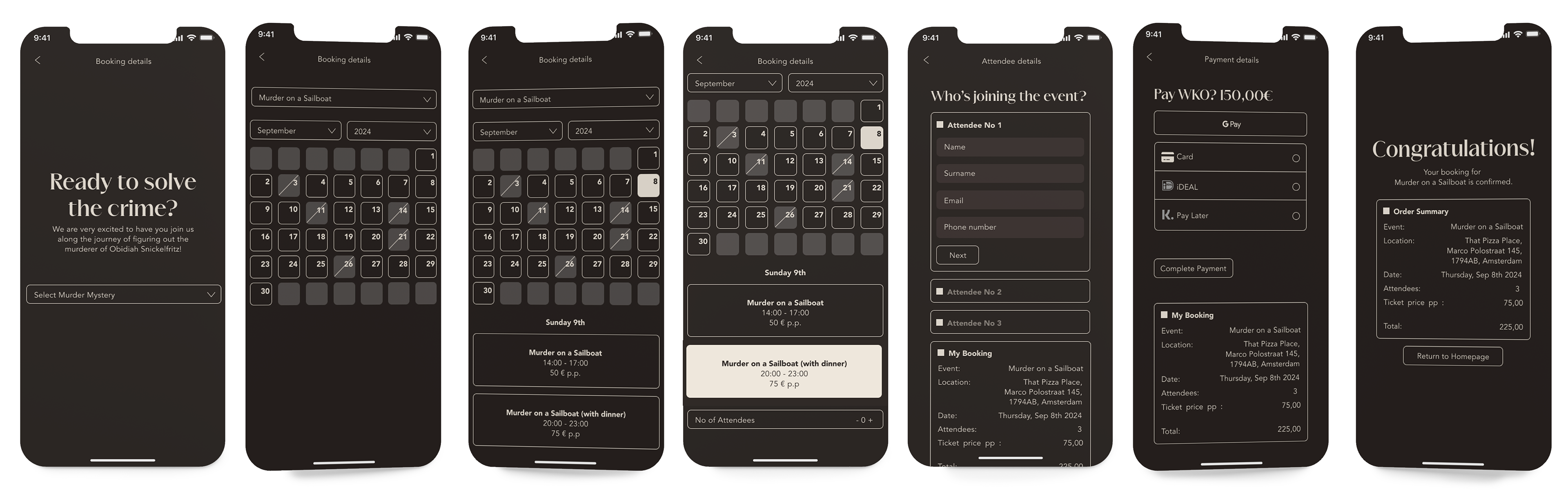
Wireframes & Lo-fi Prototype
I decided to work on the wireframes and lo-fi prototypes using a mobile-first approach, because the majority of the users would be using their smartphones to visit the website. The wireframes helped me validate the decisions made during the user flow design process, and revealed some steps that needed to be included.
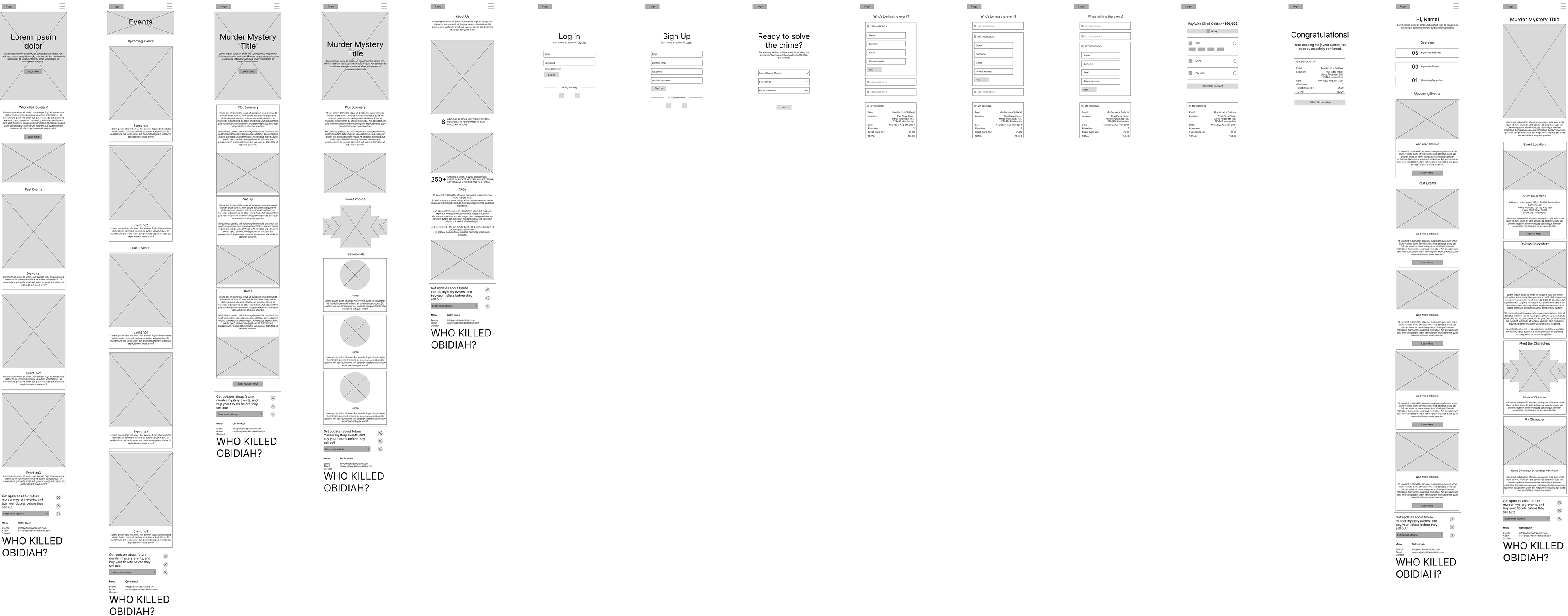
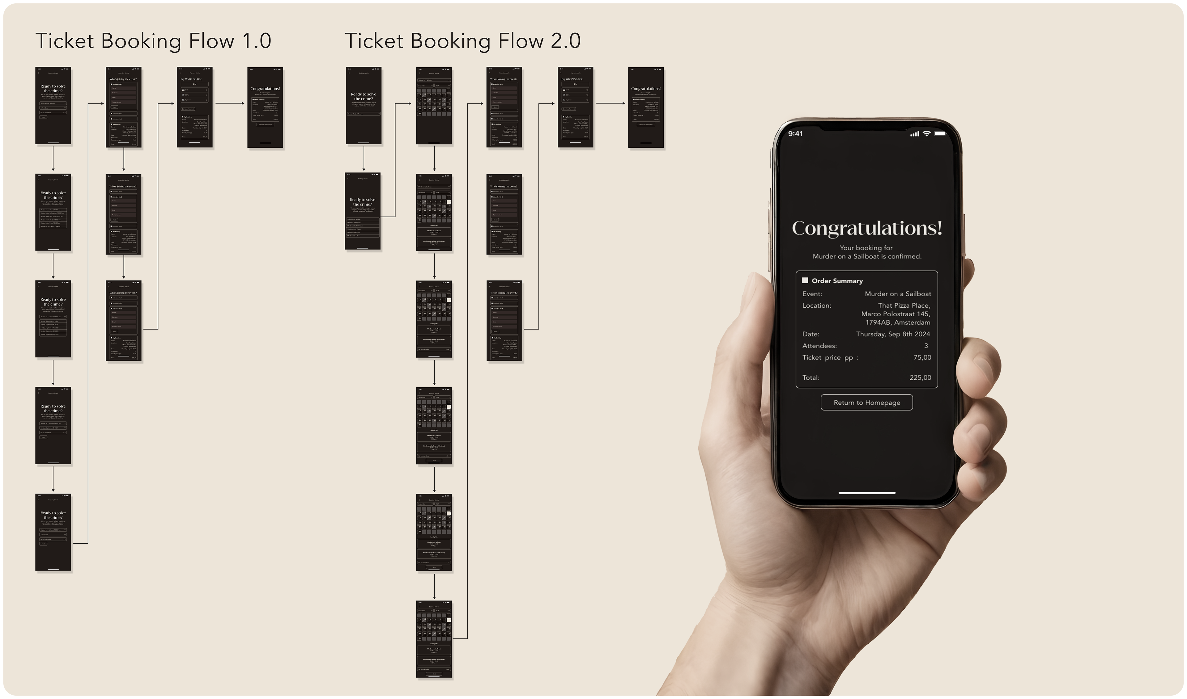
Usability Study
I conducted a usability study with 4 users once the mobile prototype was ready. The study revealed a bottleneck during the ticket booking task, so the user flow had to be redesigned from the top.
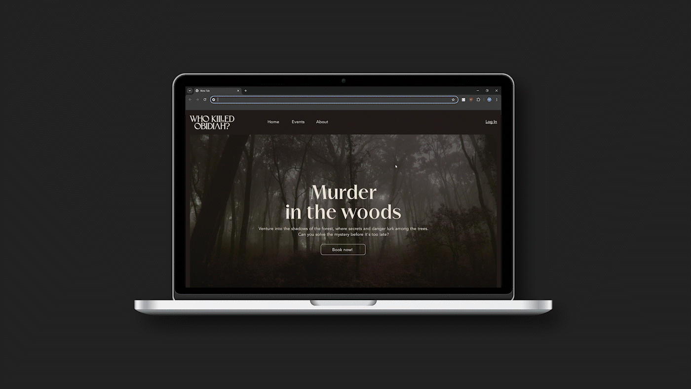
Desktop Prototype
When the mobile hi-fi prototype was finished and re-tested, I went on to design the desktop version of the website and its hi-fi mockup.
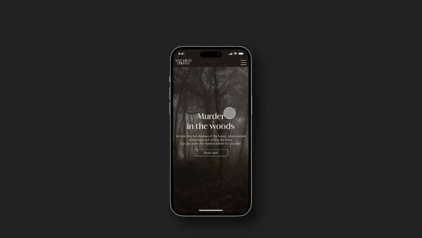
UI DESIGN
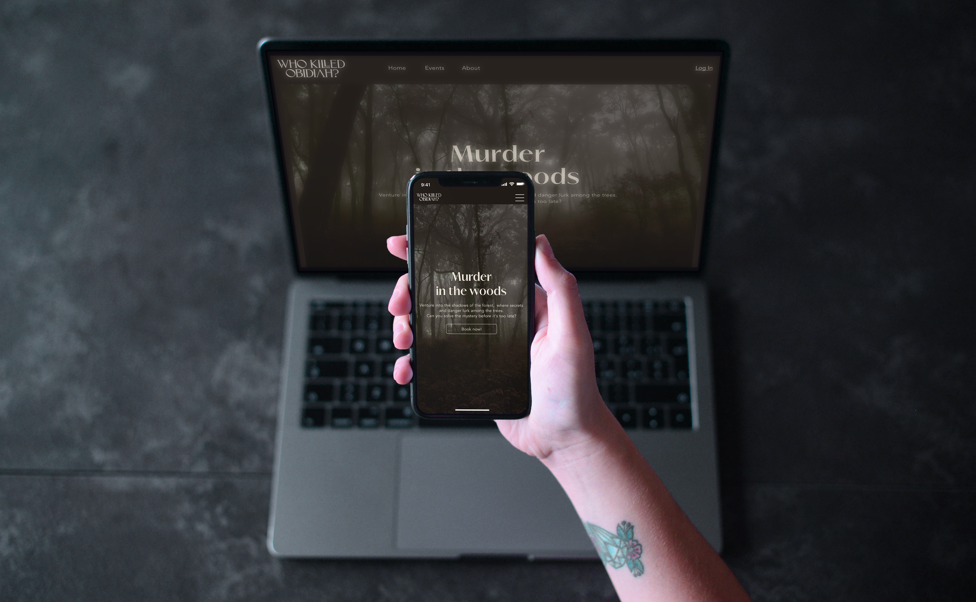
I implemented Dark Mode as a key feature, prioritizing sustainability, accessibility, and aesthetic appeal.
Sustainability
Optimizing battery usage and screen brightness, effectively reduces energy consumption. This design not only decreases charging frequency but also extends device lifespan, aligning the design with eco-friendly principles.
Accessibility
Accessibility was integral to the UI design choice of a dark mode, because it reduces eye strain. I ensured compliance with WCAG guidelines for contrast, making the site usable for individuals with visual impairments. Thoughtfully chosen fonts enhance readability without compromising the aesthetic, ensuring that all users can engage with the content comfortably.
Aesthetic Appeal
The design captures the essence of a murder mystery, creating an engaging atmosphere that intrigues users. By blending visual elements with the brand identity, I aimed to foster excitement and anticipation, enriching the overall user experience.
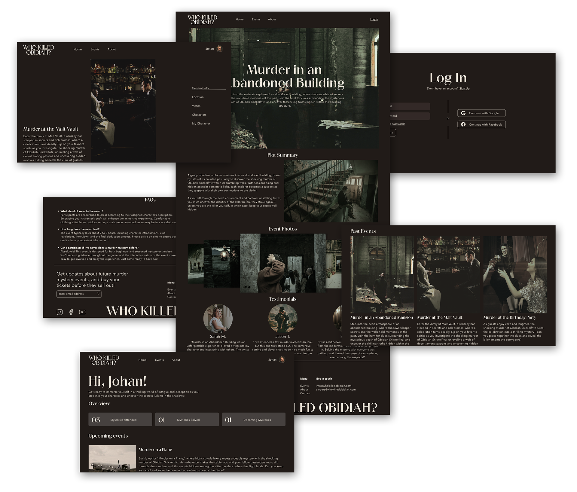
Browsing Home, (upcoming and past) Events and
About pages on desktop.
About pages on desktop.
Logging in, browsing Profile page and Personal
(upcoming and past) Events on mobile.
(upcoming and past) Events on mobile.
Reflections
This project taught me a lot about designing user flows. During the usability study, I had the opportunity to observe the users and see how the ticket booking flow I had designed caused them frustration and anxiety. It was interesting to see what the different users were expecting to come next, instead of what I had thought the would. Putting together the insights of the usability study, designing a few iterations and coming up with the final flow, was a key learning moment in my UX design journey.